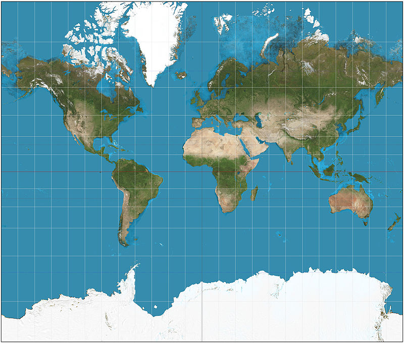
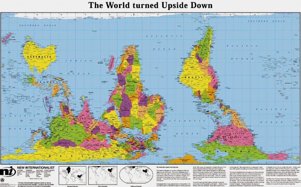
I assume, this is the world as you know it. Do you notice where your eyes keep on wandering?

My eyes magically seem to be drawn to the upper half of this map. The northern hemisphere. Many people have remarked on this, and how this is not pure chance. It is a good representation (supported by the Greenwich meridian and by our preference for golden ratio layouts, I suspect) of the power imbalance on planet earth.
I’ve made a conscious choice not to follow such standards anymore without questioning, and if you find that to follow those norms is merely convenient, then let me tell you that therein exactly lies the problem. We have been exposed to the same views time and again, and our curiosity sufficiently dulled, we forget how questionable these views are.
Since, as studies on cognitive metaphors quite convincingly tell us, up is good, and down isn’t (here’s a random source), it is more than obvious that here in South Africa I’m up south, while many of you guys are down north, in that minuscule appendix to Asia called “Europe”. On a more serious note, consider how the exposure to an inverted map affects your sense of locale, and try to imagine which long-term side effects the standard Eurocentric north-ientation of the world has had. Consider this map for a while, and position yourself in it. How does it feel?

While in standard north-iented maps Africa looks like a heart, in this version it looks more like
 Cool, I find 😉
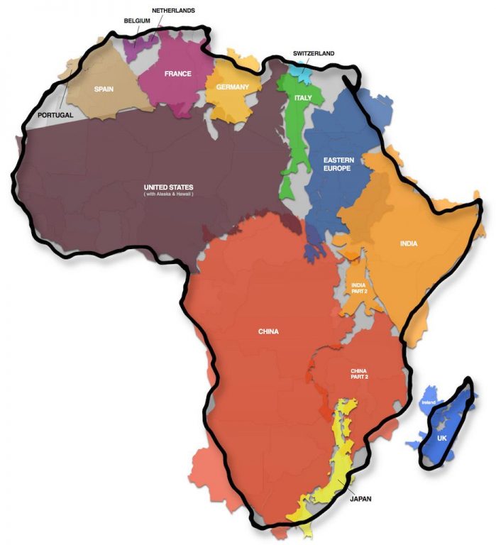
Moreover, Europe and every other place in the northern hemisphere (with a large amount of space covered by land) are disproportionately large, and Africa in contrast much too small. Usually, and that is in the standard Mercator projection, Africa appears to be the same size as Greenland. This is nonsense, and just the effect of projection, in more than one sense of the word. Europe was the known, Africa the unknown, hence it may have seemed appropriate to blow Europe out of proportion so as to have enough space for all those place names. However, over time the acceptable justification for this approach vanished, and gave way to a willful distortion of the African continent on maps. A racist choice. Here you get a vague idea of the size of Africa.

Read up on it here:
https://matadornetwork.com/read/true-size-africa/
and here.
